Gransnet forums

Coronavirus

Stats and graphs - % or raw numbers?

(21 Posts)
MawBe Wed 16-Jun-21 08:54:32

I expect to be trampled underfoot by those more experienced than I in the matter of statistics ( Remember, “There are lies, damned lies and statistics”)
However what bothers me is when graphs of % appear to show doom and gloom, while raw numbers say otherwise - or vice versa.
I live in a village of 1000 inhabitants so it would take 100 positive diagnoses to say our Covid rate was 1 in 100,000. Yes?
That figure is unimaginable. Or have I got this arse about tip?
I think we may have had a total of about 20 cases over the course of the pandemic and no fatalities, but if the four cases last month had followed on from two the month before would the local headlines (if we had any) have screamed 100% rise in cases - ?
So looking at the Downing Street press conferences, I and others fear Boris Johnson’s scientific advisers seem to be deploying their graphs skilfully and selectively to back up the warnings of potential catastrophe.
But take a closer look and the choice of graphs is arguably disingenuous: the slides are most revealing for what they failed to include.
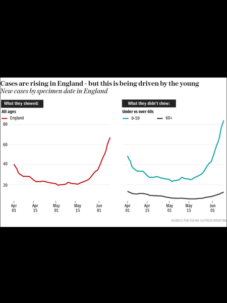
On hospital admissions, we were shown a graph comparing the change in the proportion of under and over-65s admitted to hospital in January and in May-June.
This showed a big jump in the under-65s column, a point Prof Chris Whitty, England’s Chief Medical Officer, took pains to emphasise.
The problem is that this fails to show just how much lower the raw , actual numbers are now.
In reality, there were 95,172 admissions for Covid in England between Jan 1 and 28, compared with 2,851 between May 16 and June 12.
But a brief glance at the graph – which is all you get on TV before “Next slide please” could well give the impression that the situation in hospitals is worse than last winter.
These are from today’s DT and I suppose I, like many am feeling depressed that despite being better vaccinated than just about any country in Europe, we are more locked down than they are too.

MawBe Wed 16-Jun-21 08:56:04

These didn’t post - sorry

MawBe Wed 16-Jun-21 08:56:36

Oops- yes they did - retires in confusion

Elegran Wed 16-Jun-21 09:06:36

First of all, yes, you do have it arse about tip. 100 in 1000 is one in ten. Imagine them all standing in a row, and then one in every ten stepping forward. There would be a hundred in the front row.

I haven't read the rest of the post yet (just sitting down to breakfast) so won't comment on the rest.

GrannyGravy13 Wed 16-Jun-21 09:10:20

Totally agree, lots of figures have doubled etc. sound bites around. It takes a bit of digging to understand the situation.

I wonder how many days/weeks before we have a new variant (epsilon I guess will be it’s given name) another excuse to keep restrictions in place.

(Totally unrelated, in my little corner of the world there has been an obvious downturn of mask wearing this week, maybe heat or maybe folks are rebelling?)

Alegrias1 Wed 16-Jun-21 09:15:35

Hope you’re sitting down Maw, we’re going to agree again smile

First, 100 cases in a village of 1000 people is 10,000 per 100,000, that would be disastrous.

Whitty et al are very good indeed at using their graphs to get across the message that they think is important. I don’t blame them for it, but it is manipulation. Some people can look at the graphs and say “yes, but…” while others just see big rises. I actually took heart from the slides on Monday because it showed that the biggest rise in cases and hospitalisations is in the unvaccinated population. Not great for them, but it means that as we get them vaccinated things should get better, which is why I support a pause in easing until we get that done.

On the other hand, although numbers are low at the moment they could go up if we don’t take action, so showing the relative size of cases today compare with during the second wave could make people complacent.

I don’t agree with the lies, damned lies and statistics thing. There are lies, damned lies and people who are good at using statistics to get their message over wink

Mollygo Wed 16-Jun-21 09:21:54

You’re right about one thing though. My DGD’s school had one case, and isolated the class. A few days later it emerged that another child (same class) had tested positive. That’s 100% increase in cases! If you don’t know the raw figures, percentages are not really helpful.

geekesse Wed 16-Jun-21 09:27:50

If numbers double every two weeks, it takes just fourteen weeks for 10 cases to rise to 1280. The rate of change is what matters. If number double every week, you could have 1280 cases in seven weeks.

Elegran Wed 16-Jun-21 09:29:04

Two cases one month, then four the next means the number of cases doubled. In statistical terms doubled is a rise of 100% on the figures of the previous month , so that would be correct for that area and those dates. If you add "from 2 to four" into the statement it becomes clearer to the 99% of us who can't "see" a statistic.

With the 95,172 for Jan 1 to 28, and the 2,851 for May 6 to June 16, they could highlight ( with computer technology) the two figures and the two points on the graph and add something like "This is much better than that, but it is more than last week, and we don't want that rise to continue or we will be into another peak" or some such thing. It is true that with a more infectious variety, more people are potentially cathing it from each case, so any rise in one week could be even bigger the next - if it were doubling each week it would go 1, 2, 4, 8, 16, 32, 64, 128, 512, 1024 2048 and so on.

However, I am not sure Boris understands statistics either, and whenever a scientist has tried to tell us the unvarnished truth, he gets howled down and called a doom-monger.

Alegrias1 Wed 16-Jun-21 09:35:21

An example of scientsts telling the unvarnished truth...

One member of independent SAGE told us that there would be a huge number of deaths and hospitalisations this summer based on the infectiousness of the delta variant and the number of unvaccinated people. I can't recall the peak number but it was based on 7 million people becoming infected between now and the end of July, I think. Could happen.

Only 4 1/2 million people in the UK have been infected since the start of the pandemic. As well as the axes of graphs, we need to know the starting assumptions as well.

MawBe Wed 16-Jun-21 09:51:00

Elegran

First of all, yes, you do have it arse about tip. 100 in 1000 is one in ten. Imagine them all standing in a row, and then one in every ten stepping forward. There would be a hundred in the front row.

I haven't read the rest of the post yet (just sitting down to breakfast) so won't comment on the rest.

So isn’t 100 in 1000 the same as 1= in 100,000?
I said we have a population of 1000 so to achieve a stat of 1 in 1000,000 wouldn’t you times the 1 by 100 ? confused

MawBe Wed 16-Jun-21 09:52:35

Feeling really dense this morning- blame Chris Whitty! ???

Peasblossom Wed 16-Jun-21 09:53:05

Umm 4.5 million have had a positive Covid diagnosis.

It’s a bit different from 4.5 million have been infected??

Alegrias1 Wed 16-Jun-21 09:54:20

Yes, I agree Peasblossom.

Alegrias1 Wed 16-Jun-21 09:55:51

100 in 1,000

is the same as 1,000 in 10,000 (times both sides by 10)

is the same as 10,000 in 100,000 (times both sides by 10 again)

MawBe Wed 16-Jun-21 09:57:00

I really did get that the wrong way then? If the population were 100,000 we would need 400 cases to achieve the same stat?

MawBe Wed 16-Jun-21 09:59:15

Might be best to give up teaching me Higher Math ???

Alegrias1 Wed 16-Jun-21 10:05:42

For a village of 1,000 people to have a stat of 1 in 100,000, 0.01 people would have to have a positive COVID diagnosis. wink

MawBe Wed 16-Jun-21 10:25:31

You can see why I prefer raw numbers! ?

growstuff Wed 16-Jun-21 10:47:31

Now I'll really confuse you MawBe. The stats usually given are the number of new cases in a given time and the incidence rate per 100,000, ie the number per 100,000 who are infectious at any one time. People are infectious for longer than a day, so the incidence rate and the new cases aren't the same.

Example:

Day 1: 1 person tests positive. Over the course of the next couple of days, it's likely that one person will infect at least another two people, if no steps are taken to self-isolate.

Day 8: 2 people have now tested positive, but the original person has (hopefully) recovered, but possibly not, so there could be two or three people still ill. The two new people will probably infect another 4 people.

Day 15: At least 4 people will be infectious. The previous cases will no longer be infectious, but they could still be ill and possibly need hospitalisation.

In a village of 1,000 that would be an incidence rate of 400, which would be high.

The trouble with raw numbers is that you can't compare areas. Four cases in your village would be high. Four cases in London would mean almost nothing.

MawBe Wed 16-Jun-21 14:19:13

Think I’m coping!