Gransnet forums

News & politics

How would you have hung it?

(82 Posts)
Esspee Sat 29-Oct-22 08:41:19

A work by Mondrian has apparently been hung upside down for possibly 75 years.
Personally I would have hung it the same way as the gallery.

How about you. Which way up looks best to you?
If it helps the title is New York City 1.

Quokka Sat 29-Oct-22 15:49:27

I’m remembering a story about the Emperor’s new clothes wink

Aveline Sat 29-Oct-22 15:51:28

I'm remembering a story about insensitive people. Art is not just about representative images. It's how it makes people feel. Or, obviously, in some cases, not feel.

Callistemon21 Sat 29-Oct-22 15:53:24

Aveline

I'm remembering a story about insensitive people. Art is not just about representative images. It's how it makes people feel. Or, obviously, in some cases, not feel.

When I look at it I feel like eating a lattice top apple pie 😁
Wearing a plaid skirt.

poshpaws Sat 29-Oct-22 15:56:36

Opal

I don't see how anyone can call it art - it's pretentious rubbish. Belongs in a skip.

Agreed!

maddyone Sat 29-Oct-22 16:06:45

Callistemon21

I had a closer look - it's lattice.
Like a pie or treacle tart.

grin

maddyone Sat 29-Oct-22 16:08:47

When I look at it I feel like eating a lattice top apple pie.

gringringrin

M0nica Sat 29-Oct-22 16:14:24

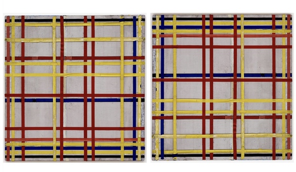
I do not dislike Mondrian, some I have seen i would happily give house room to. But not this one, not even having the title helps.

DD insists that if you have to know the title of a work of art, especially if it comes with an explanation, to understand it, then it is the piece of paper with the title and explanation that is the work of art, not the picture/sculpture itself. Discuss!

I am afraid, as I said before, I think this painting would look better as a textile design, a nice tweed fabric, then i will have a coat made from it.

NotSpaghetti Sat 29-Oct-22 17:09:29

I'd also like it as fabric M0nica - but I actually like it as art too 😄

GrannyRose15 Sat 29-Oct-22 17:51:22

I quite like the picture and would hang it on my wall. But I don't think it matters much which way up it is. I would have thought that was what modern art was about "no right way up".

MissAdventure Sat 29-Oct-22 17:56:33

I prefer the right hand picture.
No idea if that's right or not, but I don't like it anyway.

GrannyRose15 Sat 29-Oct-22 17:57:43

DD insists that if you have to know the title of a work of art, especially if it comes with an explanation, to understand it, then it is the piece of paper with the title and explanation that is the work of art, not the picture/sculpture itself. Discuss!

I do tend to agree. Reading the explanation often takes so much time that it detracts from appreciation of the art itself. Sometimes it helps to read about a piece of art but only after you have had an emotional response to it. And I hate over detailed explanations in the same way I hate over-analysed poetry or literature. A creative piece should be able to speak for itself.

MrsKen33 Sat 29-Oct-22 18:55:07

If you have to read an explanation the basic premise of a work of art has been lost. It should appeal in some way to you,

Mizuna Sat 29-Oct-22 19:00:21

I could live with the Mondrian both ways. I have an abstract painting in my home which I have to hang horizontally because the way it was supposed to be displayed - vertically - doesn't fit my wall space. It looks great.

Glorianny Sat 29-Oct-22 19:12:11

I like Mondrian. I started out thinking the right hand image was the right one ,but now I'm not sure. The lines and squares do represent the NY grid system, but look at the picture and the lines seem to move. It is a representation of the city its constant activity, its lights, its buildings and its heart. You may not be able to see it, but that doesn't mean it isn't there.
As for the remarks about it being easy to do, just try it. Most people can't paint a straight line and certainly not ones which intersect.

Yammy Sat 29-Oct-22 19:32:41

I'm a philistine as well to modern art as well. It looks like a good pattern for a tablecloth. I'd rather have a Botticelli or Cezanne.

Glorianny Sat 29-Oct-22 19:50:13

There's a complicated mathematical concept behind the paintings as well.

Callistemon21 Sat 29-Oct-22 21:24:15

Oh, I missed that.
All I could see behind it was apples. 🍏🍏🍏

Mollygo Sat 29-Oct-22 21:31:10

This piece of art is amazing. It’s so easy for young children to look at and recreate their own versions, giving practice in using a ruler and colouring neatly or drawing a straight line on the computer and using the flood tool.
Challenge-can you do it without having a colour in adjacent spaces?
Not sure it matters which way up it is (ENC) but most children will be insistent about which way up their work should be.

Callistemon21 Sat 29-Oct-22 21:34:52

I will download it and examine more closely.

Septimia Sat 29-Oct-22 21:35:31

Personally I prefer it as in the first picture. When the extra lines are at the bottom it gives it weight and stability. With them at top it make me feel unsettled.

But I wouldn't hang it - except perhaps face to the wall! No, that's a bit harsh, but I can't call that sort of thing "art". To me it's "design". Sometimes modern art/design is interesting, especially when you know the reasoning behind it. Too often the meaning is unfathomable.

Deedaa Sat 29-Oct-22 21:41:02

Interesting that a piece of work that was painted 80 years ago is still referred to as Modern Art.

CanadianGran Sun 30-Oct-22 05:11:53

I agree with Septimia in that I like the way it was originally hung; the darker lines closer to the bottom give it weight and feels more natural to me.

Is there a link to the story? How did they know it was hung incorrectly?

I have mixed feelings about modern art. If it evokes emotion of some sort then it feels like art, but some of it seems a bit silly or pretentious to me somehow. If an art critic needs to explain how it should make me feel, or what it represents, then I feel like I am being spoken down to like a child that 'doesn't get it'. Some of it feels like snobbery to me.

Same with some of the art installations. Is there a point, and if I am made to feel foolish for not understanding it, then I'm not really interested.

Farzanah Sun 30-Oct-22 09:51:03

Deedaa

Interesting that a piece of work that was painted 80 years ago is still referred to as Modern Art.

I think it means that it is part of the modernism movement, rather than contemporary Deedaa.

I did read somewhere that the the artist intended the tighter lines at the top representing the sky.

Glorianny Sun 30-Oct-22 10:04:31

The dark lines at the top is the right way. www.theguardian.com/artanddesign/2022/oct/28/mondrian-painting-has-been-hanging-upside-down-for-75-years

The mathematical concepts and his use of the golden ratio is fascinating. It involves a belief in a deep spiritual meaning for art. I suppose if all you are looking for is a pretty recreation of a scene it doesn't do that.But then why should it?

NotSpaghetti Sun 30-Oct-22 10:12:53

I'm glad I know which way it was intended to be hung Glorianny.
That's the way I like it.
Your eyes ard drawn to the top. It doesn't feel like sky to me but could be the top of buildings lowering over me. It has strength and presence that way up I think.