Gransnet forums

News & politics

How would you have hung it?

(81 Posts)
Esspee Sat 29-Oct-22 08:41:19

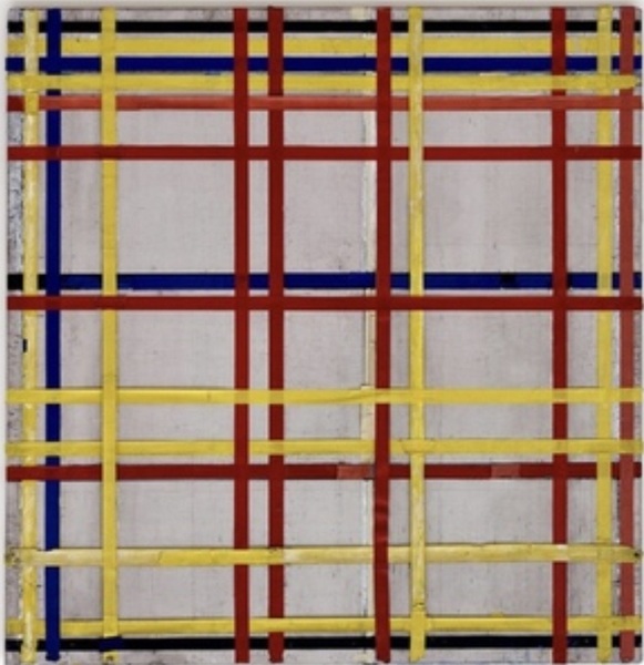
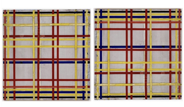
A work by Mondrian has apparently been hung upside down for possibly 75 years.
Personally I would have hung it the same way as the gallery.

How about you. Which way up looks best to you?
If it helps the title is New York City 1.

Oopsadaisy1 Sat 29-Oct-22 08:46:00

Let’s hope there is now an arrow on the back saying
This Way Up.

I prefer it upside down.

Aveline Sat 29-Oct-22 08:58:14

I do like Mondrian's work. I suppose I'd prefer what the artist had intended it to look like.

Parsley3 Sat 29-Oct-22 10:27:42

I too am a fan of Mondrian. Someone made a mistake and I am glad it has been corrected.

Urmstongran Sat 29-Oct-22 10:33:38

I think every quarter I’d give it a 90° turn because it’s a square.
That said, modern art is a bit Emporer’s New Clothes for me.
😮

silverlining48 Sat 29-Oct-22 10:40:22

Not sure I would hang it at all, I tend to go with emperors new clothes too.

Farzanah Sat 29-Oct-22 10:55:36

I like Mondrian but am not a particular fan of this pic. I think it looks completely different hung “the wrong way”. Have a look at some of his still life and landscape pictures which are beautiful if you’re not a fan of abstract.

Riverwalk Sat 29-Oct-22 11:02:02

I too prefer it the way the artist intended.

M0nica Sat 29-Oct-22 11:16:23

Which way was the way the artist intended? I prefer the first picture, but would also have been inclined to hang it at right or left angles.

It would make a nice textile design, good wool tweed design and then made into a statement coat. I would wear it.

Caleo Sat 29-Oct-22 11:38:53

I like it the right way up because then the busiest part is at the top end. That way up my eyes go on an upward movement.

maddyone Sat 29-Oct-22 11:41:45

It looks like a picture of the school climbing frame when it’s put away against the wall. I’m sorry, I’m a Philistine where art is concerned, unless it looks like something I recognise.

Namsnanny Sat 29-Oct-22 11:48:47

I would hang it as the left picture.
But, seeing the two together, the right is more dynamic by far.
Just lines and colours but they convey subtle meanings. I suppose that's the mark of a true artist?

storynanny Sat 29-Oct-22 12:10:07

Reminds me of art with infants- we made no drain pictures using the red blue yellow and black logic block rectangles!

LadyGracie Sat 29-Oct-22 12:16:37

I would have hung it in the shed.

Scribbles Sat 29-Oct-22 12:31:08

I assume the design is supposed to represent the grid pattern of the streets and avenues of Manhattan, in which case the one on the right looks more accurate.

MrsKen33 Sat 29-Oct-22 13:03:30

Try sideways !!

Prentice Sat 29-Oct-22 13:13:39

Caleo

I like it the right way up because then the busiest part is at the top end. That way up my eyes go on an upward movement.

Yes, that is what I think too.
Having said that, this artwork does nothing for me at all.

Prentice Sat 29-Oct-22 13:14:32

maddyone

It looks like a picture of the school climbing frame when it’s put away against the wall. I’m sorry, I’m a Philistine where art is concerned, unless it looks like something I recognise.

grin
He has done better things it is true.

ginny Sat 29-Oct-22 13:45:26

I wouldn’t hang it anywhere unless I was paid a large amount of money.

Callistemon21 Sat 29-Oct-22 13:49:28

Namsnanny

I would hang it as the left picture.
But, seeing the two together, the right is more dynamic by far.
Just lines and colours but they convey subtle meanings. I suppose that's the mark of a true artist?

The meanings are too subtle for me 😁
Unless he is meant to be gazing out through prison bars?

However, as fabric design it would be ok.
I prefer the left hand picture, the one on the right is top heavy.

Callistemon21 Sat 29-Oct-22 13:50:37

I had a closer look - it's lattice.
Like a pie or treacle tart.

Namsnanny Sat 29-Oct-22 14:49:15

Noooo! dont put the idea of prison bars in my head. I shall never be able to look at his grids and blocks of colour the same again.

I have felt both energy and/or peace when looking at different versions.

Opal Sat 29-Oct-22 15:03:54

I don't see how anyone can call it art - it's pretentious rubbish. Belongs in a skip.

NotSpaghetti Sat 29-Oct-22 15:41:28

I like it as the right-hand picture...
This way:

NotSpaghetti Sat 29-Oct-22 15:49:19

I have downloaded it and tried it all 4 ways BTW.
The heavy lines at the top make me think more of New York, tall buildings and narrow streets.

It also looks interesting with the heavy lines on the left. It "feels" very different that way.
I don't like it so much with the "weight" at the bottom.